Chart types
Depending on measurment, one or two types of charts will be available. If two are available, buttons for switching chart type will appear above chart:
Total chart
Measures
Shows total value in bars. Actors can be found on X axis, and their total values on Y axis.

Values on bars correspond directly to values in table on right side. Clicking on a bar will show you a list of issues that were counted.
Insights
Shows total value in one bar.

History chart
Linear history graph
Shows how the value changed over time. X axis represents time, Y value in given time. Values are grouped into weeks.
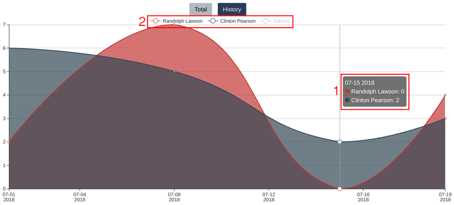
This type of chart has some extra functions (areas marked red on picture above):
- When you hover over datapoint, a floating box will appear - it contains a date and exact values of every actor
- Actors can be toggled by clicking their name in top section of chart. When actor is not shown in graph, their name will be grayed out (e.g. "Admins" in picture above)
Clicking on datapoint will show you a list of issues represented by it.
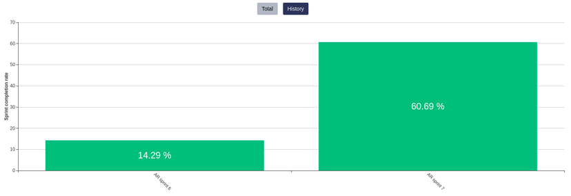
Bar history graph
History graph in Sprint completion rate insight consists of bars with completion percent for each sprint. Bars are orded by sprint start date.
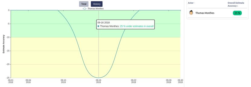
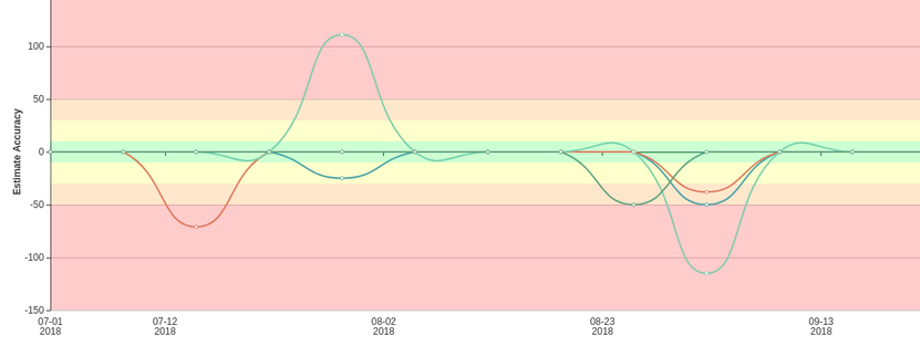
Double sided linear history graph
History graph in Estimate Accuracy measurement consists of:
- both positive and negative Y values representing estimate accuracy (respectively: over and under estimates)
- colorful mark area
- tooltip with details
X axis represent time. Values are grouped into weeks.